If you’re anything like the rest of us, you’ve probably been taught to never judge a book by its cover. Right?
Well, the same can’t be said for the podcasting world.
Your podcast artwork is one of the first things the potential listener will see. And the quality of it will absolutely aid their decision on whether they hit play, or keep on scrolling. It will be judged, so it needs to be good.
Don’t worry, though. Because here are 16 of our expert top tips to help you out in the process.

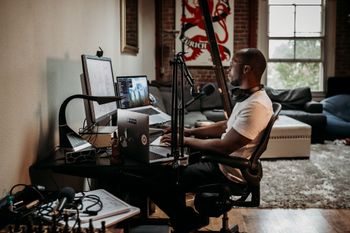
Book Your Next Podcast Guest the Easy Way
With more than 70,000 members, MatchMaker.fm is the largest online community connecting podcasters & guests.
Join MatchMaker todayWhat Is Podcast Artwork?
Otherwise known as ‘cover art’, podcast artwork is what podcasters upload to their chosen podcast host to represent their show. It’s what potential listeners will see first (more on this later), and it sits on the podcast’s page within each podcast directory. Like this:
Don’t confuse your podcast artwork with your podcast logo, however. They’re entirely different assets. So whilst a piece of podcast artwork represents the individual show, a logo represents the wider brand in which the show sits under.
You might want to incorporate your logo into your artwork somewhere. Doing so can add a nice touch, but it’s not always necessary.
Why Is Podcast Artwork Important?
It’s simple enough. Having some form of podcast artwork is a standardised requirement for uploading shows to podcast directories. In other words, listening platforms (like Spotify, Apple Podcasts, and Google Podcasts) won’t list your show if it doesn’t have any artwork. Meaning nobody will be able to listen to it.
More obviously (and as touched on above), podcast artwork is one of the first things the potential listener will see. So it needs to be interesting, enticing, of a good quality (you don’t want to look unprofessional), and representative of what your show’s actually about. And yes, people will absolutely decide if your show’s worthy of a click based on what they see first. If it fails to grab attention, poor download figures will likely be the result. No pressure.
16 Tips for Creating Great Podcast Artwork
Now we’ve laid the foundations, let’s jump to the good part. Here are 16 expert tips to help you create an effective piece of podcast artwork.
1. Make Sure It Meets Directory Requirements
Before we get carried away with the creative stuff, let’s start with the technicalities. Every piece of podcast artwork has to meet certain requirements. Not meeting them simply means your creation won’t be accepted by the various directories, resulting in your show not being listed. Thankfully, every podcast directory has the same specs (pretty much). And if you follow Apple Podcasts’ requirements, you should be good to go. We’ve summed them up below:
- It must be a square, or a 1:1 ratio
- It must be between 1400 x 1400 and 3000 3000 pixels
- It must be 72 dots per inch resolution
- It must be in the RGB colour space
- It must be either a JPEG or PNG file (albeit JPEG is preferred)
2. Make It Adaptable for Use Elsewhere
Your podcast artwork is essentially the face of your show. And because you’ll need it for promotion across multiple places, it needs to work everywhere. We’re talking website banners, business cards, social media posts, any merch you might want to make (like coasters), plus anywhere else you think is a good fit.
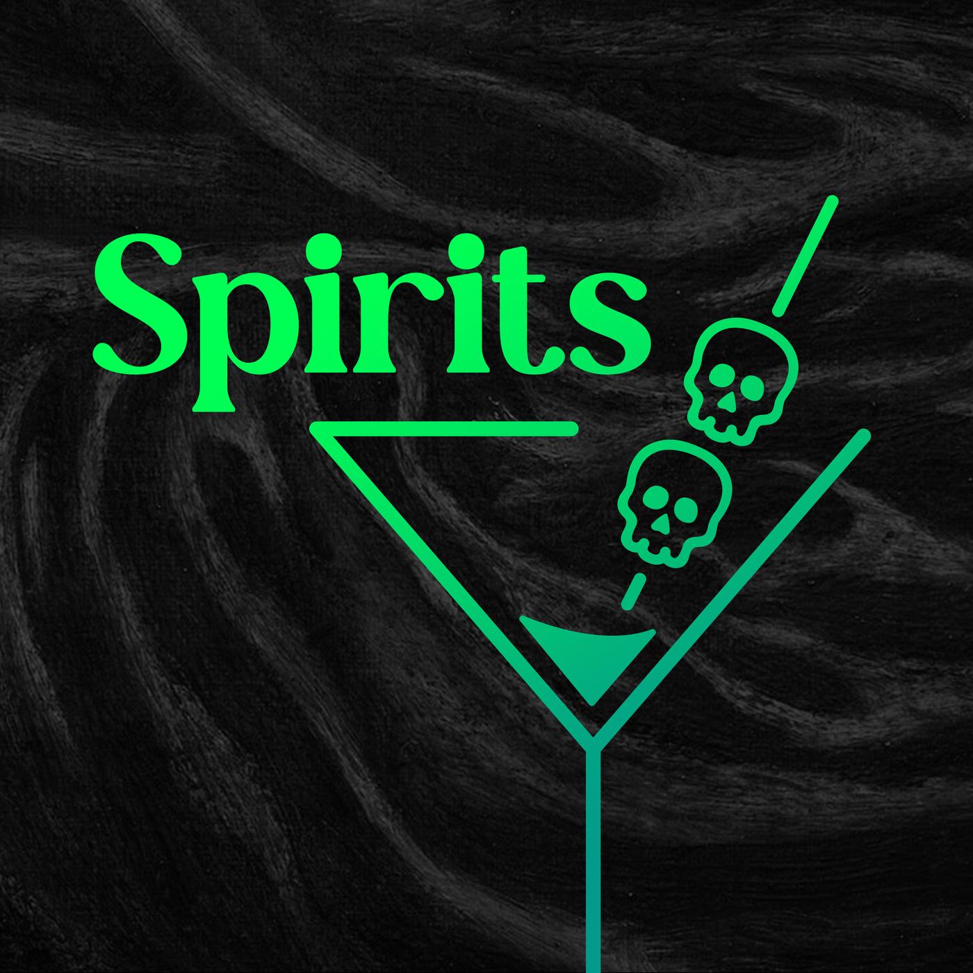
You don’t have to use the exact same artwork for all of the above. But using consistent images, fonts, and colours will help make your brand recognisable. Look at how the Spirits podcast does this, for example. Their cover art looks like this:
But a piece of their merch looks like this:
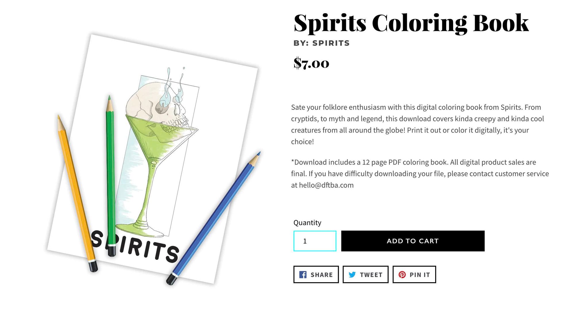
The images used in the artwork and colouring book are different, but they’re coherent and work well together. And it’s immediately obvious they’re part of the same brand. Make sure your podcast artwork is flexible enough to work well across multiple sizes, formats, and locations.
3. Consider Your Audience
Once you’ve defined your show’s style, brainstorming what you know about your target audience is useful. How old are they? What gender are they? What colours or images resonate most with them? Plus, what sort of podcast artwork is likely to engage them? A younger demographic will have very different preferences to an older one. And a creative audience will have contrasting preferences to a more business-minded one. It’s your job as the artwork designer to find this information out, and use it to appeal to your listenership.
4. Research the Competition
It goes without saying there are already a lot of podcasts out there. And that means there are a lot of good podcast artworks already in the mix. Carrying out some competitor research on other designs in your space will give you an idea of what listeners engage with, and what’s already been done. You don’t want to simply replicate another brand’s style. Instead, look at what artwork already exists and think how you can make yours unique.
5. Communicate Your Show’s Tone, Subject & Message
The point of your podcast artwork is to attract people who want to hear what you have to say. You want to give them a decent idea of the podcast’s tone, subject, and genre at a glance. Is it a comedy? True crime? Health and fitness? Whatever the answer is, the artwork should reflect that. It should be a visual representation of your show’s story, and theme. You want to show what’s unique about your podcast, too. So figure out what makes your podcast perfect for your target audience, and try to represent that visually.
6. Make It Enticing & Visually Engaging (But Don’t Over Do It)
Fun and visually-engaging artwork will always resonate more with listeners than something that’s stiff and boring. Plus, they’ll be more inclined to click it in the first place if it immediately grabs their attention. That being said, don’t go OTT. If it’s too busy with lots going on, it runs the risk of being unclear, meaning potential listeners will have to stop and think about what your show’s actually about. In reality, they won’t be willing to do this and they’ll probably just scroll on by instead. Aim for memorable, but subtle. Engaging, but clear and concise.
7. Avoid Using Too Many Words
Less is more when it comes to using words on your podcast artwork. So try not to pack it with too many. As a rule of thumb, we recommend no more than 5 words in total. The title of your podcast should be enough. Short, catchy, and clear is much better than long, overwhelming, and cramped.
8. Don’t Use Explicit Language or Imagery
This one should be pretty obvious, but we’ll cover it anyway. Always avoid explicit language and references to illegal drugs, profanity, nudity, hate speech, and violence in your podcast artwork. This is a requirement set out by Apple Podcasts, and refers to both language and imagery. If your finalised design ignores any of the above rules, it will violate the terms set out by your podcast directory. And as a result, your show will likely be removed from the platform all together.
9. Choose the Right Typography
We get it. It’s easy to get carried away testing out all the different typefaces for your podcast artwork. You want it to look attractive, and you want it to represent who you are. Don’t get carried away, though. The number one priority with any words on your artwork is that they’re readable. And this has got to be true even when it’s been shrunken down to a small icon on a phone screen. As beautiful as an intricate type font might look, it’s no good if it’s difficult to read. We’d also recommend sticking to one or two fonts. Any more and your artwork will be visually confusing.
Try to avoid overused fonts, too. There’s nothing wrong with going old school with your lettering. But try to stay away from Arial, Times New Roman, and Helvetica. They’re too common, and listeners will already associate them with other brands. Using something a bit different will make your podcast artwork more distinctive.
10. Think About Which Imagery You Use
Your goal is to stand out from the crowd. Generic stock pictures of headphones and microphones might sound like a good idea, but by now, directories are filled with those types of images. Plus, to put it bluntly, they’re just not visually interesting.
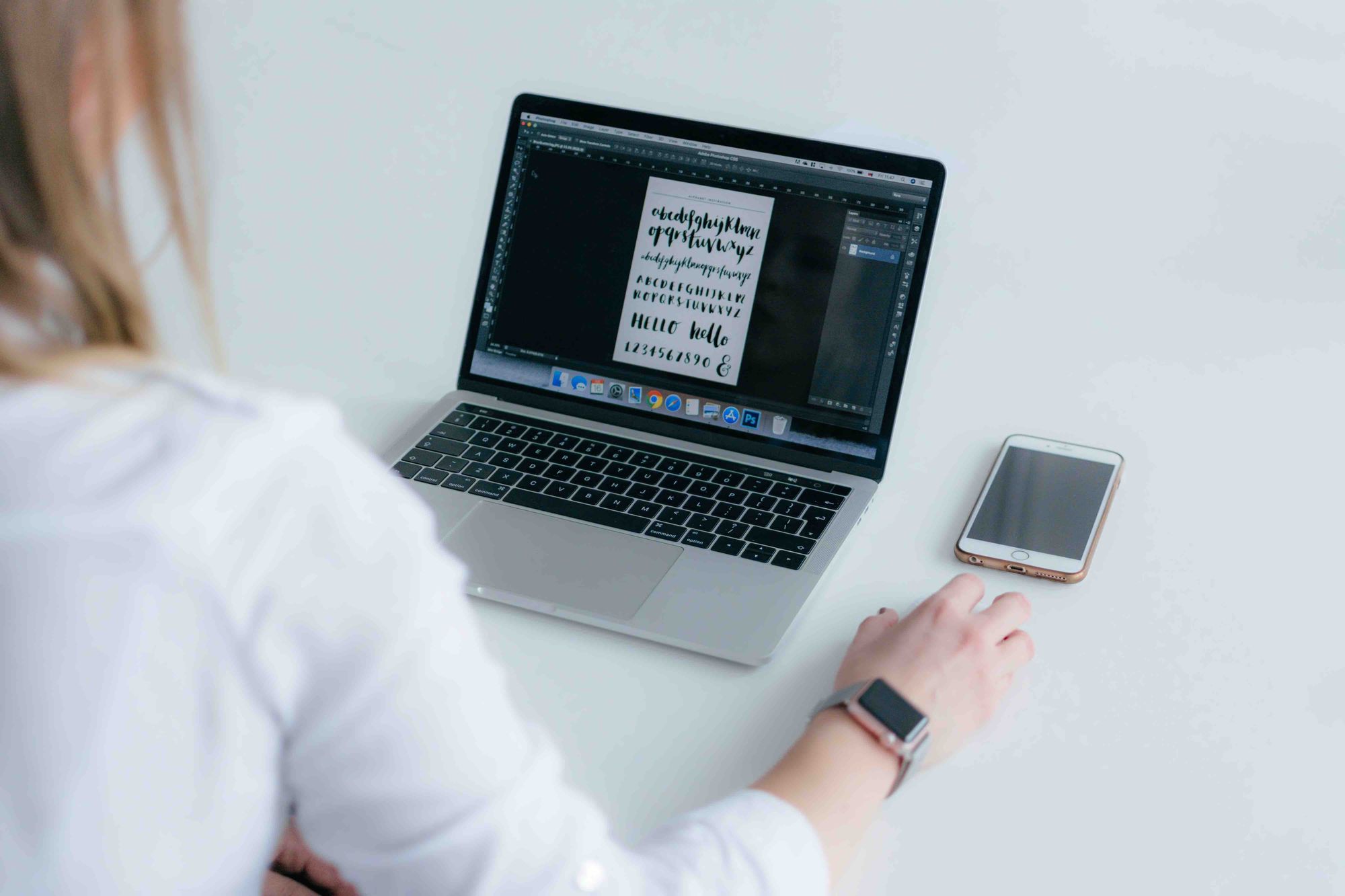
The first thing to decide on is the type of image you’re going to use. You might want to use an image of yourself (the host), or perhaps a compelling graphic would be better suited. Either way, make sure it’s of a high quality. Blurry, pixelated images will only make people doubt the professionalism of your show.
11. Pick Effective Colour Combinations
We’ve already established that you need your podcast artwork to stand out. The colours you use will say a lot about your show. So pick them wisely, and be intentional with them. Make sure you take the time to research the connotations of certain shades, find out what they typically symbolise, and go from there. Which ones work well together? And which ones best reflect your brand and show?
Going into the psychology of colours is beyond the scope of this article. So if you’d like to learn a bit more about it, check out this guide.
12. Keep It in Line With Your Logo & Brand
If your podcast is a part of a larger brand, make sure you keep your artwork in line with everything else. You want your show to be clearly identifiable, and consistent with other aspects of your branding. This might involve using the same imagery, typefaces, colours, or the inclusion of a familiar logo. Doing so means listeners will be able to recognise your brand, and your various pieces of work as one entity.
13. Consider if ‘Dark Mode’ Could Be In Use
‘Dark Mode’ is widely popular with screen-users everywhere. It’s kinder on the eyes, and many listening platforms automatically transition to darker pallets at certain times of the day (i.e. the evening). So it’s important to check how your podcast artwork looks against a dark background. If you’re using deeper tones as your primary colour, you might want to tweak it. The aim is for your artwork to stand out, not to blend into the device’s background.
14. Ask Friends & Family for Feedback
Before you finalise your design, it’s always a good idea to ask friends or family what they think of it. Do they like it? Do they think it’s effective? Do they agree that it captures the tone of your show? Would they change anything? Doing so gives you another perspective, which is often necessary if you’ve been staring at the same screen for too long. It also just gives you a chance to receive feedback, and apply it if you agree.
15. Remember to Compress It
Before you upload your podcast artwork to your chosen directories, you need to consider the actual size of it. The file size, that is. Images that are too large will take longer to load. And longer loading times can absolutely have a negative impact on the listener’s experience. Chances are they won’t be willing to wait around for your show to load up. It needs to be quick and painless. If you can’t provide that, they’ll simply click off and go somewhere else.
16. Know You Can Edit It Later On
The last one’s easy. Don’t fixate on having to get your podcast artwork bang-on from the get-go. Chances are you’ll want to change or edit your design as your show grows and develops. And that’s completely fine.
3 Examples of Great Podcast Artwork
Now that we’ve explored what a good piece of podcast artwork entails, it’s time to take a look at everything in action. Luckily for us, our production arm over at Cue Podcasts specialise in creating podcast artwork for clients. So we’ve picked out 3 original examples that have worked really well, and highlighted some key takeaways from each that you may want to implement in your own design.
Example #1: Deep Dive
Hosted by sailing legends, Stevie Morrison and David ‘Freddie’ Carr, Deep Dive is a sports-punditry podcast taking fans behind-the-scenes of the 2022 Global Sailing Grand Prix. Check out the show’s artwork below:
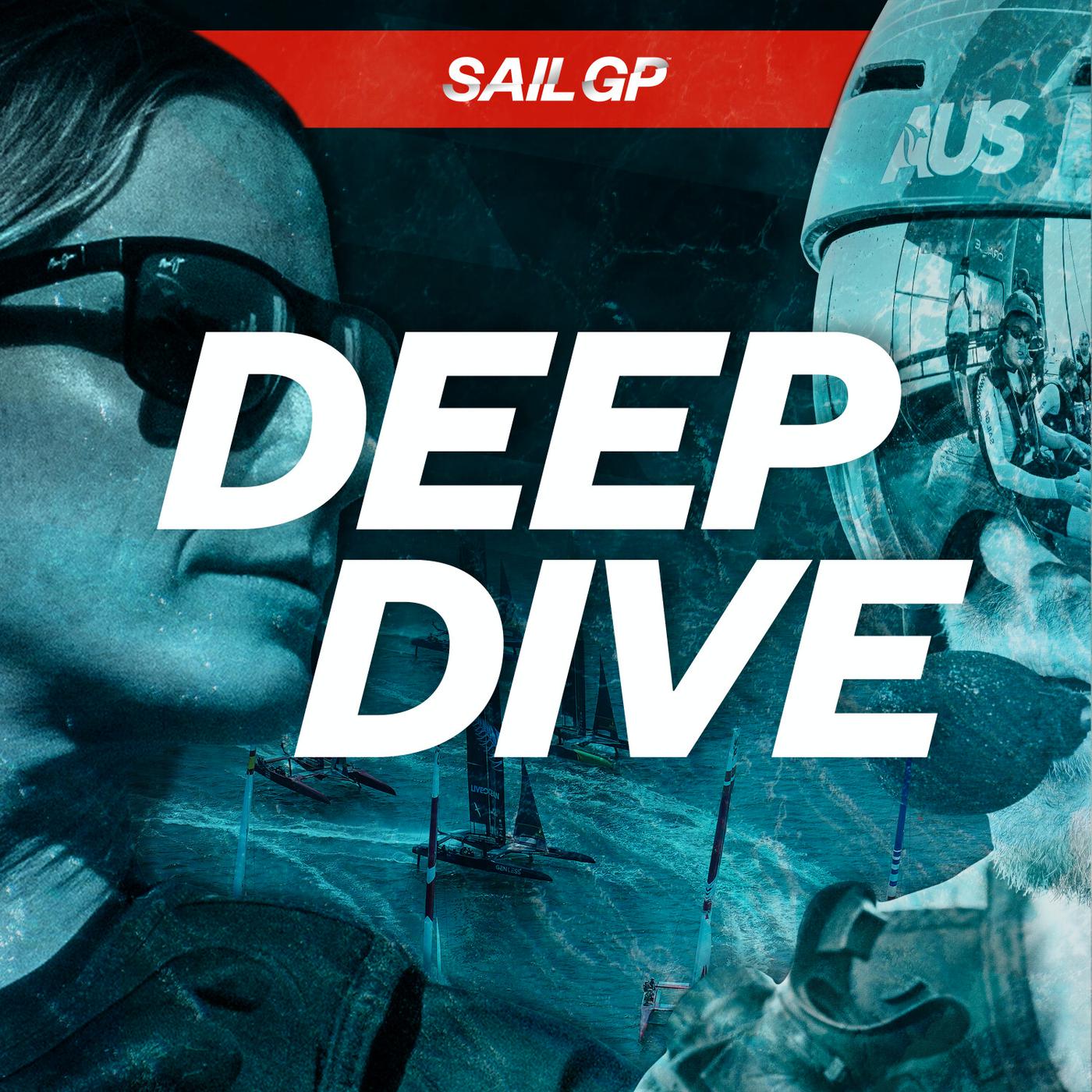
Key Takeaways:
- The podcast’s title is the centre of attention (no unnecessary words are used)
- Chosen typeface is clear, bold, and assertive
- Effective imagery represents the tone & subject of the show - sailing
- Aquatic colours have been used to reflect the water sport
- It’s carefully formatted to meet podcast directory requirements
- SailGP’s logo is incorporated to keep the branding consistent across products
- It’s striking and visually appealing to look at
Example #2: Productivity Puzzles
Hosted by Bart van Ark, Productivity Puzzles is a show investigating why there are such large differences in efficiency across and within regions - from health care to car manufacturing. Again, have a look at the finalised artwork below:
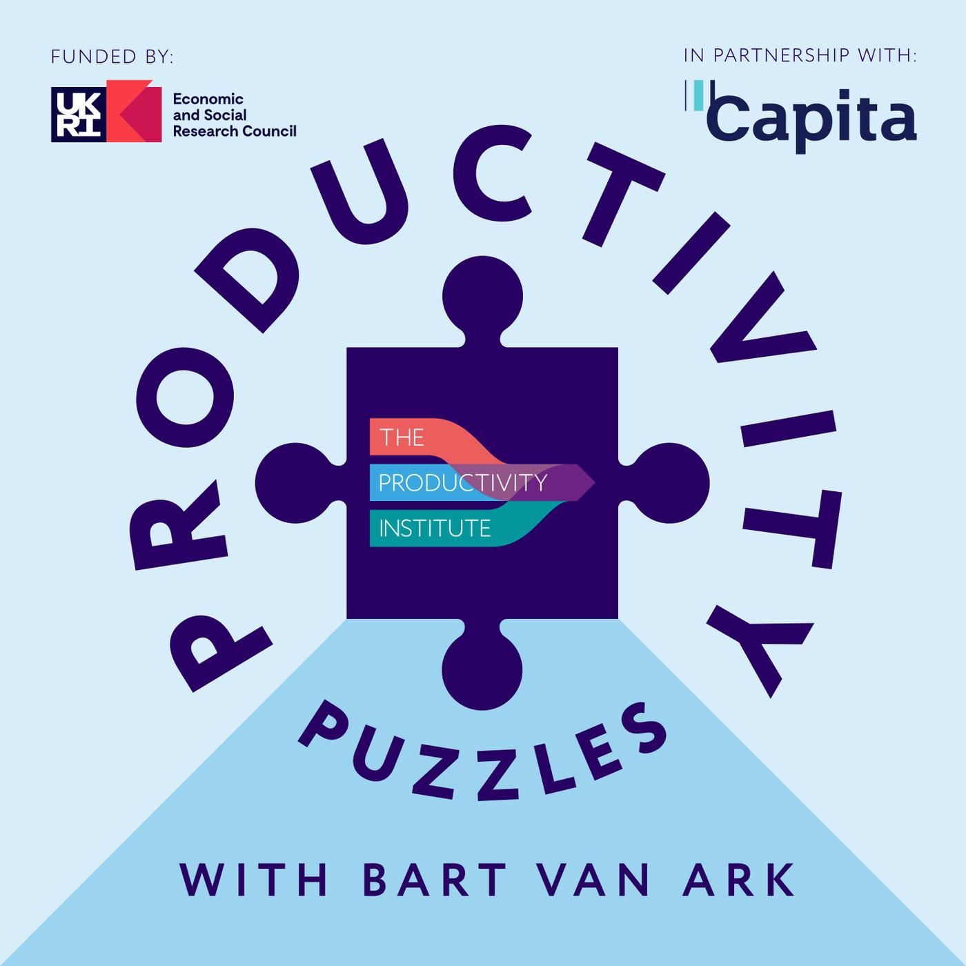
Key Takeaways:
- The artwork is immediately striking and visually interesting
- Although it states more than the show’s title, all information is relevant & easy-to-read
- Bold typeface is simple, effective, & consistent with the client’s overall branding
- Jigsaw imagery again represents the tone & subject of the show
- It meets the various podcast directory requirements
- Capita’s logo being present makes it identifiable to potential listeners
Example #3: Paws to Talk
Hosted by UK TV host, Lorraine Kelly, Paws to Talk celebrates the positive impact of dogs in our lives. It coincides with the month-long fundraising campaign 'Dogtober', which challenges Brits to walk 100km and shine a spotlight on the positive influence of assistance dogs. Check out the artwork below:
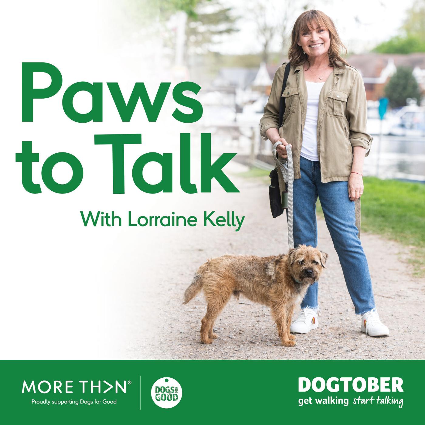
Key Takeaways:
- Dog imagery tells the audience what the show’s subject is
- The colour green typically symbolises hope, reflecting the tone of the show
- Imagery of the recognisable & much-loved host is used to entice clicks
- Provided information is once again clear and easy-to-read
- Chosen typeface is bold and stands out against background colours
- Formatting requirements have been met
- Client branding is effectively displayed
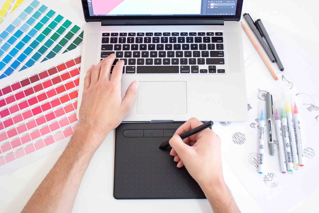
How to Create Podcast Artwork
When it comes to actually creating your podcast artwork, you want to make it appealing and professional. And because poorly-designed artwork will reflect badly on your podcast, putting time and effort into making your artwork is time well spent. There are loads of free, online tools to help you out with this. Here are a few of our favourites:
1. Canva
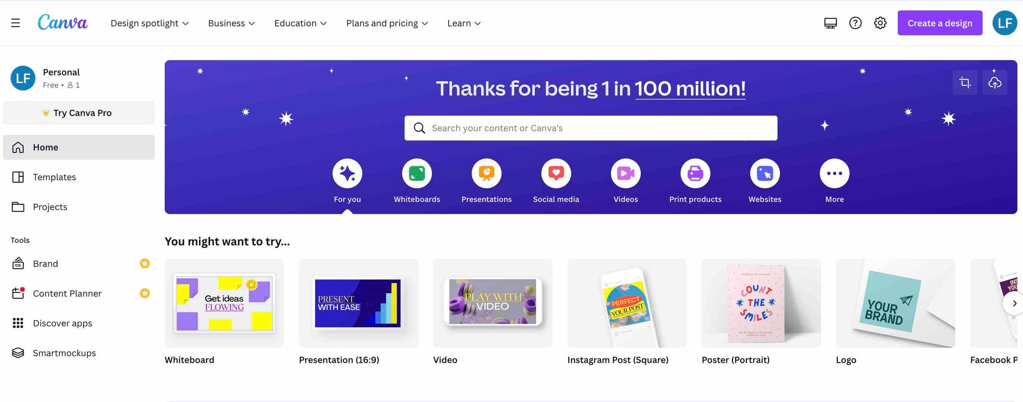
Canva is a graphic design platform that’s free and easy to use. Once you’ve made an account, you’ll be able to choose between different templates and designs to give you the best possible start. Available via the web, or through the handy mobile app.
2. Adobe Express
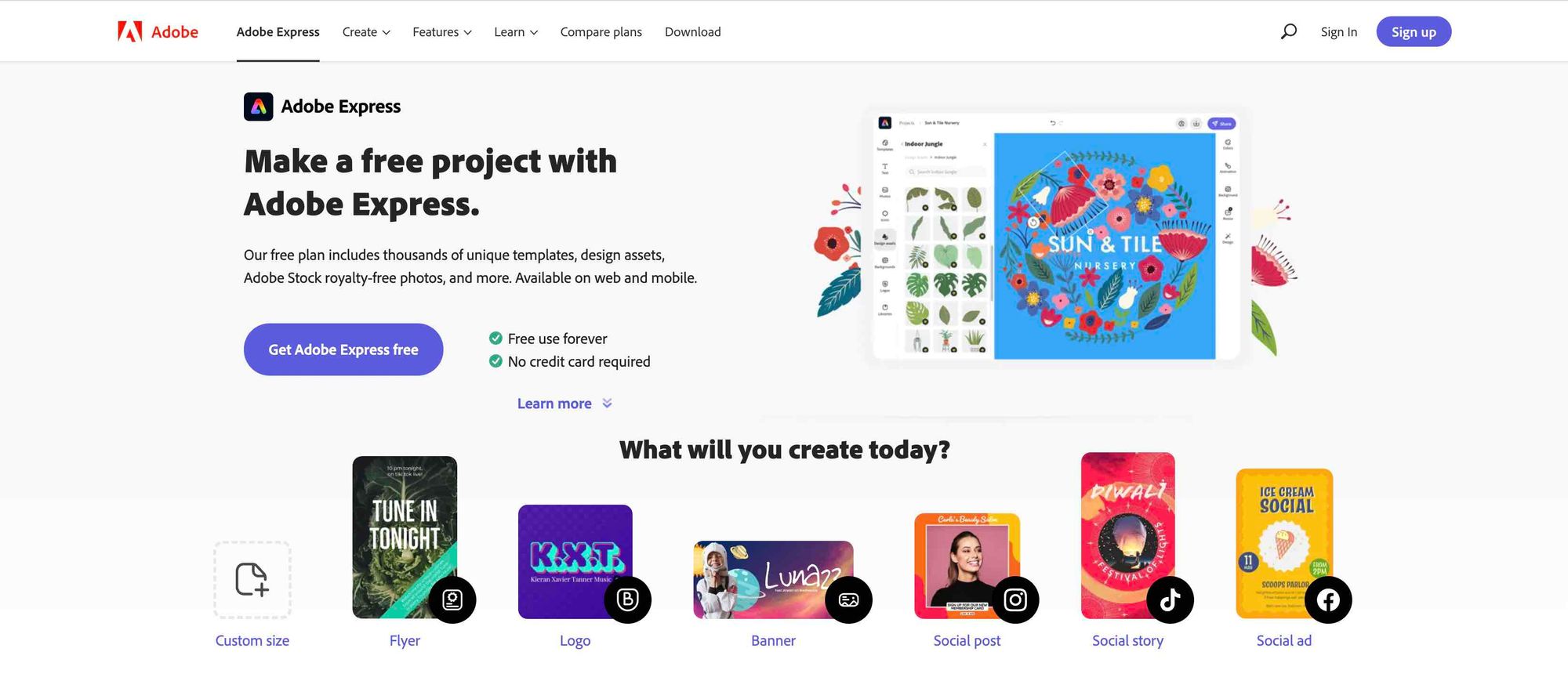
Like Canva, Adobe Express is a free graphic design tool. Once you’ve signed up, you’ll be able to choose between thousands of unique templates, royalty-free photos (although we’d recommend using your own where possible), and more.
3. Snappa
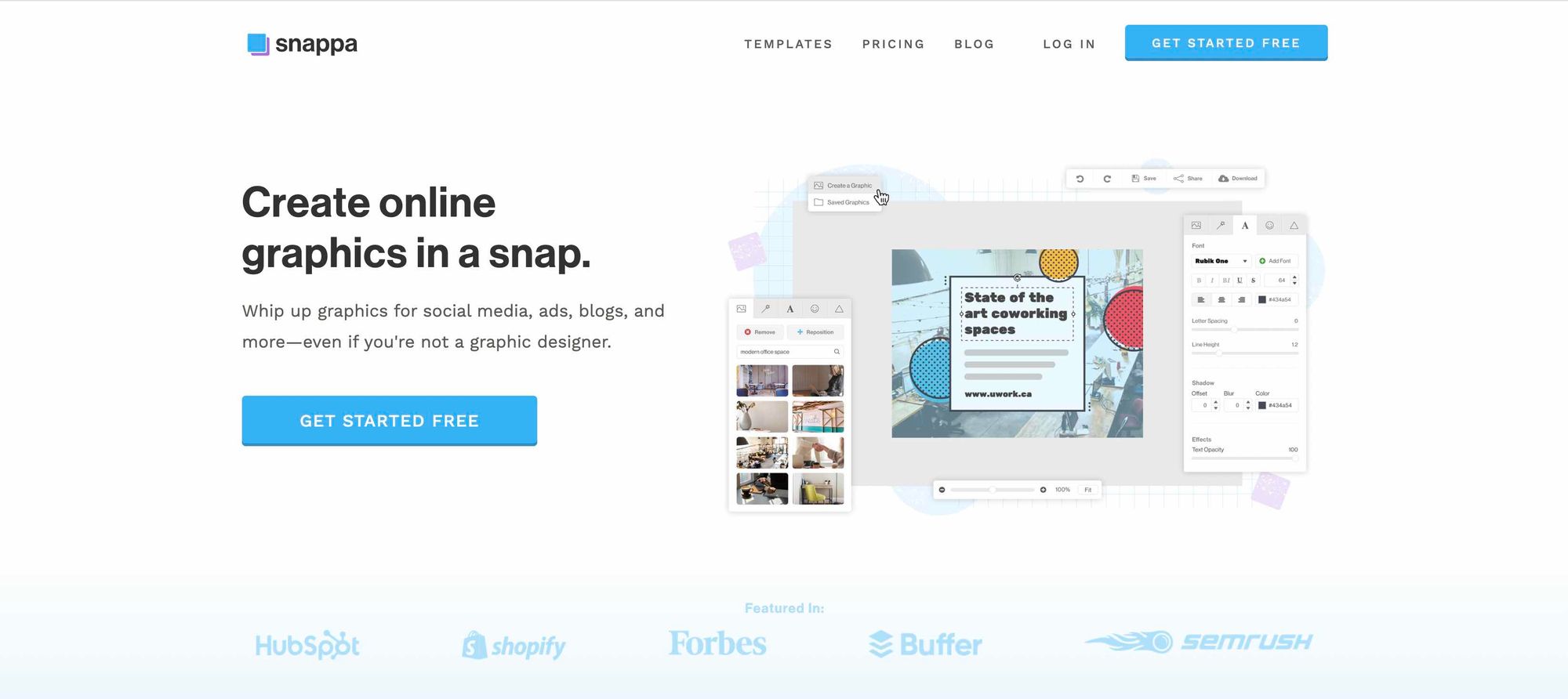
Snappa lets you create free, online graphics in a snap (hence the name). You don’t need to have any previous design experience with this one, as the pre-made templates, high-res stock photos, multiple fonts, and various effects make it an easy job. Nice.
Outsourcing Podcast Artwork
We get it. Not everyone’s a designer. If creating podcast artwork isn’t in your skill set, or you just don’t have the resource to be doing it yourself, there are freelance services that will do it for you. You’ll usually have to pay for this, but it’s a great alternative if doing them yourself isn’t feasible. If this is something you’re interested in, we’ve listed a couple of them below.
Fiverr - Freelance Services Marketplace for Businesses
Upwork - The World’s Work Marketplace for Freelancing
The #1 Podcasting Community
With more than 40,000 members, MatchMaker.fm is the largest online community connecting podcasters & guests.
Join MatchMaker today